Monday, May 23, 2011

Classed Choropleth Map

Source: http://curriculum.qcda.gov.uk/key-stages-3-and-4/assessment/nc-in-action/items/geography/9/1447.aspx

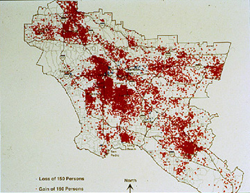
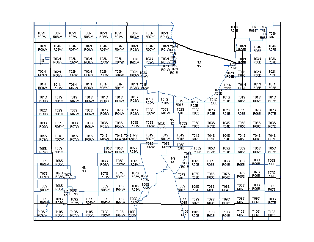
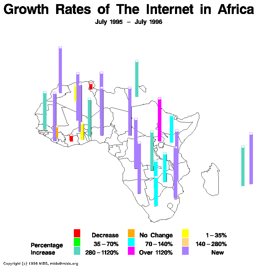
Classed Choropleth Maps are basic choropleth maps that have been broken up further for more detail of statistical information. An example of this would be talking a map of the United States and adding the additional boundaries of counties to the already present state borders.

Bivariate choropleth maps


Bivariate choropleth maps are used to display two sets of data on the same map using predetermined boundaries such as borders of states and countries. Such as depicted in the map above, it shows the data from three criteria and allows for comparison.

Nominal area choropleth map


Source: http://visualizingeconomics.com/2010/05/20/type-of-state-income-taxes/

A Nominal area choropleth map used already predetermined boundaries to display data. These maps usually use shades of colors to display the value for the area. The map above uses the states boundaries to display income tax types for that area.

Continuously variable proportional circle map


Source:http://www.neiu.edu/~nerobert/Cartography.htm

This type of map uses circles in order to depict different values of specified date. The map above shows different size circles depending on the population of american indians in the area during 1990.

Isopach


Source: http://www.noc.soton.ac.uk/gg/research/faulting/index.php

Isopach maps use circular connected regions in order to show the thickness or volume of a meteorological or geographical feature. Such as the image above is used to illustrate the volume of the amount of sediments that were disturbed on the ocean floor after an event.

Isopleths

Source : http://www.techenv.com/E-News/TE%20E-News%200705.htm

An Isopleth map uses lines that are connect to form a circular shape with other circles within the other. These circles correspond to the the same value of a specific type of data. This allows for large scale mapping of densities as pictured in the map above, these maps are commonly used for weather forcasting.

Histogram

Source : http://www.ncssm.edu/academics/science/Labwrite/res/gh/gh-bargraph.html

A histogram show values of certain sets of data at a specific time. This type of graph uses bars at a different height to show the value for the specified data set. This graph pictured, shows the amount of population broken up into age groups.

Box Plot

Source: http://bqs.usgs.gov/obsp/wy2002plots.html

A box plot is a mix between a line graph and a bar chart and helps to show where the concentration of data is.  The main chunk of usually statistical information is contained inside the box while the outliers are at the two extremes of each end. This picture above illustrates and labels the fine details of the box plot for a better understanding.

Scatter Plot

Source : http://www.netmba.com/statistics/plot/scatter

Scatter Plots are laid out upon a graph with increasing values when going outward upon the axis's. Dots are placed upon the chart corresponding to a value of information. Do to the random/scattered layout of the dots, a correlation can be discovered about the information being charted.

Population Profile

Source: http://www.bmj.com/content/324/7331/207.extract

A population profile is made up of 2 or more overlapping bar graphs. These bar graphs show density along with a specific characteristic of the group. The profile above shows the population density along with what amount of them have HIV/AIDS.

Index Value Plot


Source: http://www.techmind.org/blog/index.html

A index value plot, is simply a more precise line graph. This plot uses a line to map the increase or decrease of an event or condition. This map charts the rolling average of a financial entity over time.

Lorenz Curve

Source: http://pubs.usgs.gov/circ/2007/1294/paper1.html

The Lorenz Curve is used to depict certian economic qualities based on the ownership of said qualities.

Range graded proportional circle map

Source: http://go.owu.edu/~jbkrygie/krygier_html/geog_353/geog_353_lo/geog_353_lo11.html

Range graded proportional circle map, uses circles to show the relational aspect of the data being presented across the area and how they relate to one another as represented by the colored circles in the map above.

Windrose


A Windrose is a type graphing chart with a centralized item located in the middle and discriptors along the outer circular edge. Depending on how strong the central object relates to the outer discriptors the area will be shaded between. The graph above shows wind intensity and direction.

Climograph


Source:http://wps.prenhall.com/esm_tarbuck_escience_10/0,6440,219574-,00.html

A climograph is used to help easily show the relationship of information usually two data sets, One set of data is presentid in bar chart form and the other in line plot. This helps the viewer see relationships and cause and effect relationships.

Bilateral graph

Source: http://www.fdic.gov/regulations/examinations/supervisory/insights/siwin09/Interest_Rate_Risk.html

A bilateral graph is used to compare to sets or trials of information. These graphs are relatively simple as seen in the graph above and are mainly used for comparative and relationship demonstrations. Information presented is sometimes in bar chart form.

Triangular Plot

Source: http://instruct.uwo.ca/earth-sci/300b-001/1516fing.htm

A triangular plot is used to map the properties and/or information about different items. As can be seen above three criteria are chosen and put in each corner and the information being dissected is stretched to the appropriate corner depending upon the relationship.

Parallel coordinate graph

Source : http://servus.itn.liu.se/smartdoc/project_results/knowledge/MD-Viewer/summary.html

A Parallel coordinate graph is used to show multiple sources of related data across the same graph. The graph above shows different trials and how the events performed in different trials.

DOQQ Map

Source :http://www.tceq.texas.gov/gis/doqtnrcc.html

Digital Orthophoto Quarter Quads, these maps are made up of arial images that are done by the USGS and are usually done at a resolution of 1-5 meters. As seen above these types of maps provide a higher detail for a larger area.

DEM Map

Source: http://en.wikipedia.org/wiki/File:Oregon_DEM_relief_map.gif

DEM, stands for Digital Elevation Map. This type of mapping uses USGS map information in order to translate detailed textural maps like the one above Oregon, and represent geographical land marks.

DLG Map

Source: http://www.mapcruzin.com/free-geodata-shapefiles/usgs-geospatial-data-geodata-geographic-download.htm

A DLG map, stands for Digital Line Graph, it uses mainline digital lines and vectors in order to translate information and boundaries about the map.

DRG Map

Source: https://www.e-education.psu.edu/natureofgeoinfo/c6_p6.html

A DRG Map, is a Digital Raster Graphic, which is an scanned image from the US Geological Survey.

Isohyets Map

Source: http://soer.justice.tas.gov.au/2003/image/265/index.php

Isohyets Maps use connect boundaries within boundaries to show increased densities in a specific area. Like the map above this type of map is mainly used to show precipitation densities by showing changes of color.

Isotachs Map

Source: http://wxmaps.org/pix/avnmr.00hr.html

An Isotachs Map uses a series of lines and colors overlaid over the geograhical representation of land masses. This type of map like the one above is used to help analyse and combine complex meteorological information from across the globe

Stem and Leaf Plot

Source: http://mainland.cctt.org/mathsummer/JosephBond/StemAndPlots/stem-and-leaf_std.htm

A stem and leaf plot is used to help map and organize a set of numerical data. The numerical data is organized by value with stem being the leading number and the leaf being the trailing numbers. The stem and leaf plot above shows the Infant Mortality Rates in Western Africa.

Similarity Matrix


Source:http://iv.slis.indiana.edu/sw/simvis.html

A Similarity Matrix is a grid diagram used to show the similarity between two objects of a group represented on each axis. If there is some form of similarity between the two objects it will be represented by a shaded or colored square within the matrix.

Correlation Matrix

Source:http://www.livestockgenomics.csiro.au/Genome_to_Phenome/

A correlation matrix is a grid diagram used to show the correlation between two objects represet on each axis. If there is some form of correlation between the two objects it will be represented by a shaded or colored square within the matrix.

Star Plots


Source : http://assessment.tki.org.nz/Assessment-tools-resources/Alignment-of-assessment-tools-with-National-Standards/Reading/Observation-Survey

Star Plots are used to help visualize information. The central idea is put in the middle of the chart with other ideas and topics radiating outwards at varying lengths depending upon there relationship to the main idea. Such as the example above shows, the results of a standardized test with different colored lineds extending to different areas depending upon performance results.

Isobars Map

Source: http://www.crh.noaa.gov/unr/?n=05-06-99

An Isobar map is typical used in weather forecasting maps and projections. This type of map uses different shaped circular line boundaries to show the density of air masses and how they are interacting with the area. The above map shows a lower pressure system and the extent that its is spread out across the central part of the United States.

LIDAR Map

Source :http://www.technewsdaily.com/lasers-used-to-create-3-d-model-of-new-york-city-0548/

LIDAR stands for light detection and ranging. The use of the this type of mapping technology helps provide a more detailed map of an area compared to normal arial photos. This information like in the picture above  of the New York skyline can be used to create detailed 3D representations.

Doppler Radar Map


Source: http://www.noaanews.noaa.gov/stories2004/s2311.htm

Doppler Radar maps are pictorial representations of information gathered from weather equipment. These maps use the basic boundaries of land masses and different shades of color to show changes of densities and moisture in the sky. The above map represents a hurricane of the coast of Florida.

Cartographic Animations


Source: http://uwacadweb.uwyo.edu/JSHINKER/animations/global/

A Cartographic Animation map uses the same mapped area but shows change to an area over time. These types of maps contains the geographic boundaries of an area with changing colors or textures to represent some type of variable change to the area. The above map shows the climate change of the world over a set time period.

Cartogram


Source: http://freegeographytools.com/2007/downloadable-cartograms-from-worldmapper\

A Cartogram map is used to represent information by using land and distance to represent the variable. This map shows the geographic layout of the world with the size of the land masses proportioned differently according to the statistic being represented.

Flow Map


Source: http://www.nhcs.k12.nc.us/ogden/ThinkingMaps.html

A Flow Map, displays specific steps towards accomplishing a certain goal, in a mapped layout. This type of map contains blocks with text information inside, with arrows mapping the way through the blocks to accomplish the steps in the process. The above map contains the information and steps needed to make a peanut butter sandwich.

Proportional Circle Map


Source: http://instruct.uwo.ca/geog/242/drawlab3.htm

A Proportional Circle Map is used to help illustrate some form of of statistical information. This type of map uses a normal geographical boundary map, with different proportional circles of different sizes to indicate different values corresponding to the area where the circle is located. The Proportional Circle Map above represents an unknown statistical value of Canada and its territories.

Dot Distribution Map

Source: http://krygier.owu.edu/krygier_html/geog_353/geog_353_lo/geog_353_lo08.html

The Dot Distribution Map is used to reflect the densities of certain things in a defined area. This type of map consists of the geographical outline of an area with dots corresponding to an increase or decrease to an area. The map above represents the change in population density within the set area, each dot represents an increase of 150 people in the area.

Propaganda Map


Source: http://www.armenianreporter.am/index.cfm?objectid=B13D669A-A9FF-11DF-98620003FF3452C2

A Propaganda Map is used to sway a persons view or persuade a person towards another perspective. This type of map usually contains distorted boundaries, scales and other images in order to get a certain idea across to the viewer. This map is used to show the idea of how the world viewed countries involved in war and their influence through the use of colors and images.

PLSS Map


A PLSS Map is used to show the survey results of public land and its boundaries. This type of map contains boundary lines, plot numbers, and size information in accordance to survey results. This map shows the division of parcels of land and the labels to each one.

Thematic Map


Source: http://soils.usda.gov/use/thematic/moist_regimes.html

A Thematic Map is used to show trends of certain area at one specific point in time, by using different colors. This map shows the the different soil moistures across the United States by using different colors to show an increase or decrease.

Planimetric Map

Source : http://www.hatheway.net/gas_plant_components.htm

A Planimetric Map is a horizontal view of a set area, it usually contains symbols and boundaries of buildings and structures. This type of map like the one of above is used in the planing and design of areas before construction and development begins to avoid conflicts.

Black & white aerial photo

Source: http://www.kgs.ku.edu/CMI/how_to_use.html

Black and white arial photos are used by using high resolution film to capture a land area. This type of imaging is used to help the mapping of an area and help gain a better understanding on how an area is laid out.

Infrared aerial photo


Source: http://www.geology.iupui.edu/academics/classes/g303/Image_Interp/remote_sensing.htm

Infrared Aerial Photos are used to take photos of large areas using special types of film. This type of photography as can be seen from the image above, provides a way to easily distinguish between different types of land objects and help see through certain things such as thin layers of water.

Statistical Map


Statistical maps are used to show the relationship between a data set and a geographical area. The above map uses different sizes and colored bars to show the percentage increases in the land area of Africa of the use of the internet.

Isoline Map

Source: http://lostmanmaps.com/gallery.html

Isoline maps are used to show changes of values of different areas. This map uses lines to show boundaries within boundaries to show and increase or decrease within the boundaries. The map above show the the annual rainfall in the state of Washington, by showing the increase by changing colors and smaller boundaries.

Choropleth maps


A Choropleth Map use different shades of the same color to show the increase or decrease of a value in a geographical area. The map above uses increasing darkening shades of green to show the increasing amount of crops harvested across the USA.

Hypsometric maps


Hypsometric maps uses shades of colors and textures to show changes in elevation and geographical features. The map above depicts this by showing an area of europe and the many changes in elevations due to the mountain ranges present.  

Cadastral maps


Source: http://web.uvic.ca/vv/student/gardening/Surveying/surv3.html

Cadastral maps show defined detail about land ownership and sizes over a set area. These maps use survey information in order to show land plots and there appropriate sizes for the land plots. The map above shows the information about surveyed land plots being developed and labels them to uniquely identify them.

Topographic Map


Source: http://www.mapsofindia.com/maps/schoolchildrens/topographic.htm

Topographic maps are used to show different elevations of a geographical area. This type of map use changes in colors mainly to show the different elevations for set ranges. The map above shows the elevations of India and where snow level is at.

Mental Map


Source: http://elliottvolin.blogspot.com/2011/04/mental-map.html

 A mental map is usually a hand drawn depiction of a persons perception of some geographical area. These types of maps are usually rough and highly inaccurate and are only used for estimations. The above map is a child's depiction of what a map of the area around their school looks like.

Pictorial Map

Source: http://www.expedia.co.uk/daily/familystore/disneyparis/default.aspx

Pictorial Maps are used to for simple navigation of a small area of land. These maps usually use pictures to represent unique landmarks that can be used to navigate. The above map is of Disney Paris and is not to scale, but can be used to easily navigate the park.