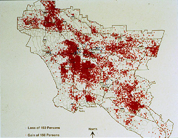
The Dot Distribution Map is used to reflect the densities of certain things in a defined area. This type of map consists of the geographical outline of an area with dots corresponding to an increase or decrease to an area. The map above represents the change in population density within the set area, each dot represents an increase of 150 people in the area.
No comments:
Post a Comment